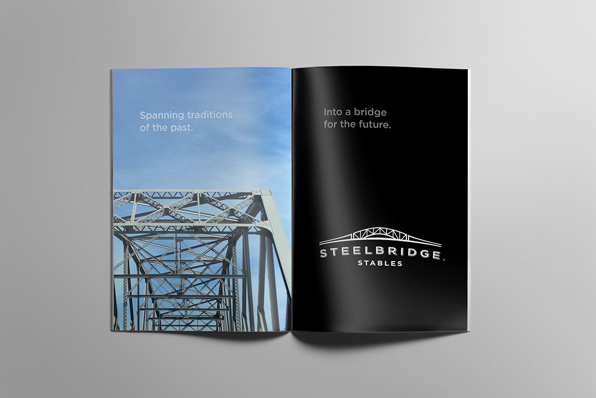
This was a journey through time. It represents the legacy of a man and the inspiration of a granddaughter. It's about family history, values and traditions – a fitting tribute to one of Canada's earliest bridge builders and a lifetime of philanthropy. Steelbridge Stables will comprise an equine stable and event facility located in the rolling hills of King Township, Ontario.
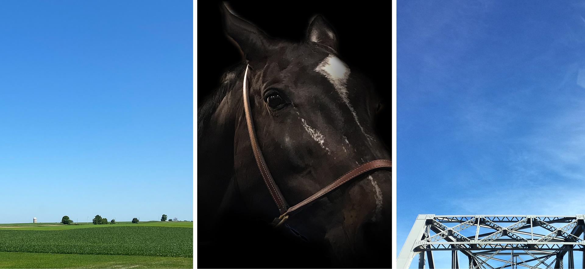
It was important that the final design reflect the trademark engineering style of the bridges he engineered and built. Equally important was to create an identity that stood on its own in a category which share many of the same brand and design characteristics.
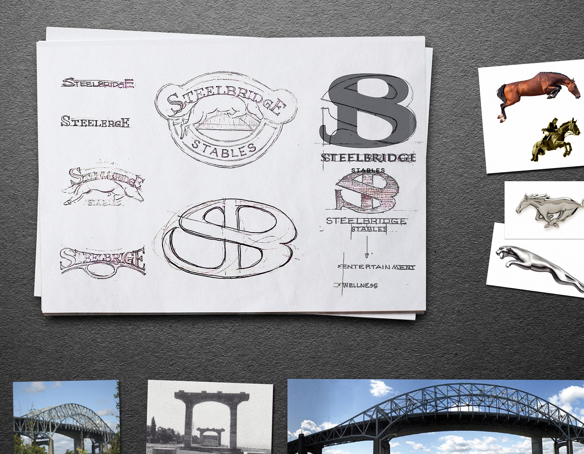
Step 1: Requirements gathering and exploration.
As with all new logo identities, it begins with a thorough understanding of the objectives and initial sparks of possibility. Themes emerge and ideas are sketched (on paper) within a variety of treatments and styles. These ideas were then shared, to further refine the execution and provide critical input early in the creative process.
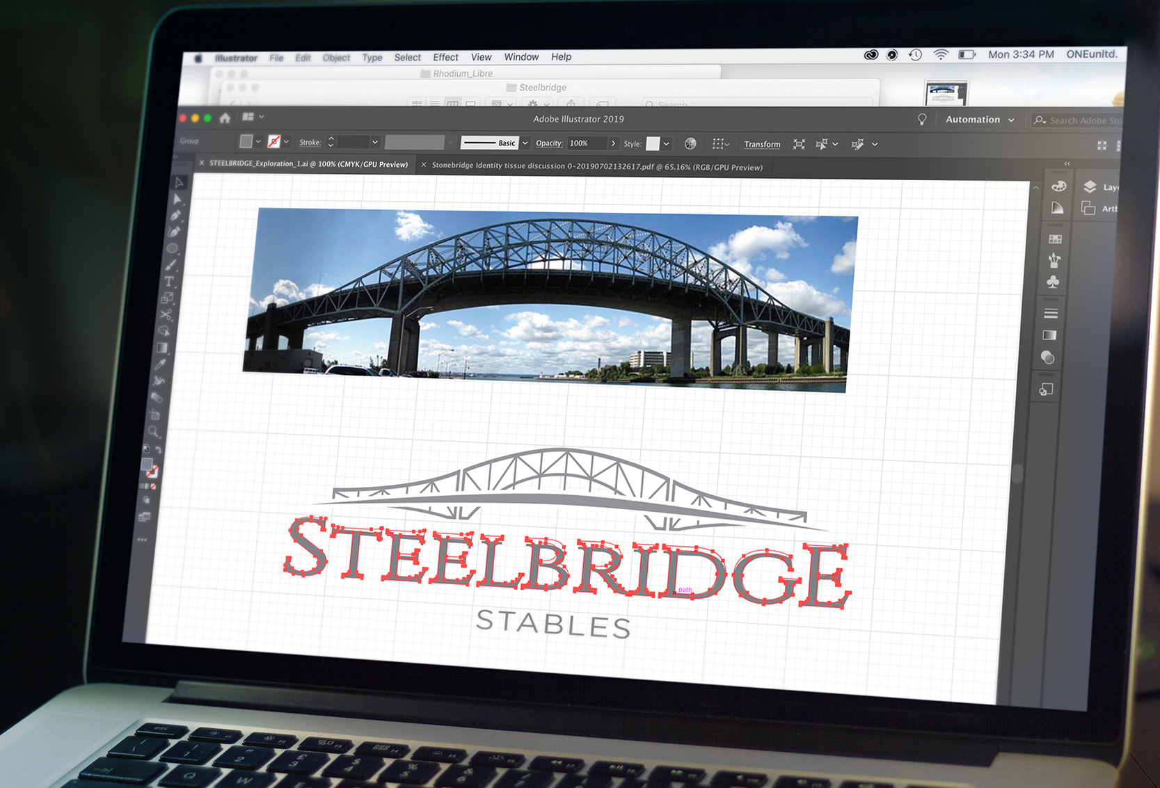
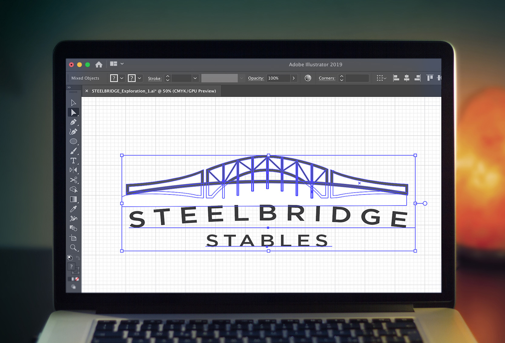
Step 2: Creative development and design
Once a direction is agreed to, sketches and reference material are used to create multiple versions of a chosen path. Further exploration and refinement continues throughout this step to arrive at a final logo and brand identity.
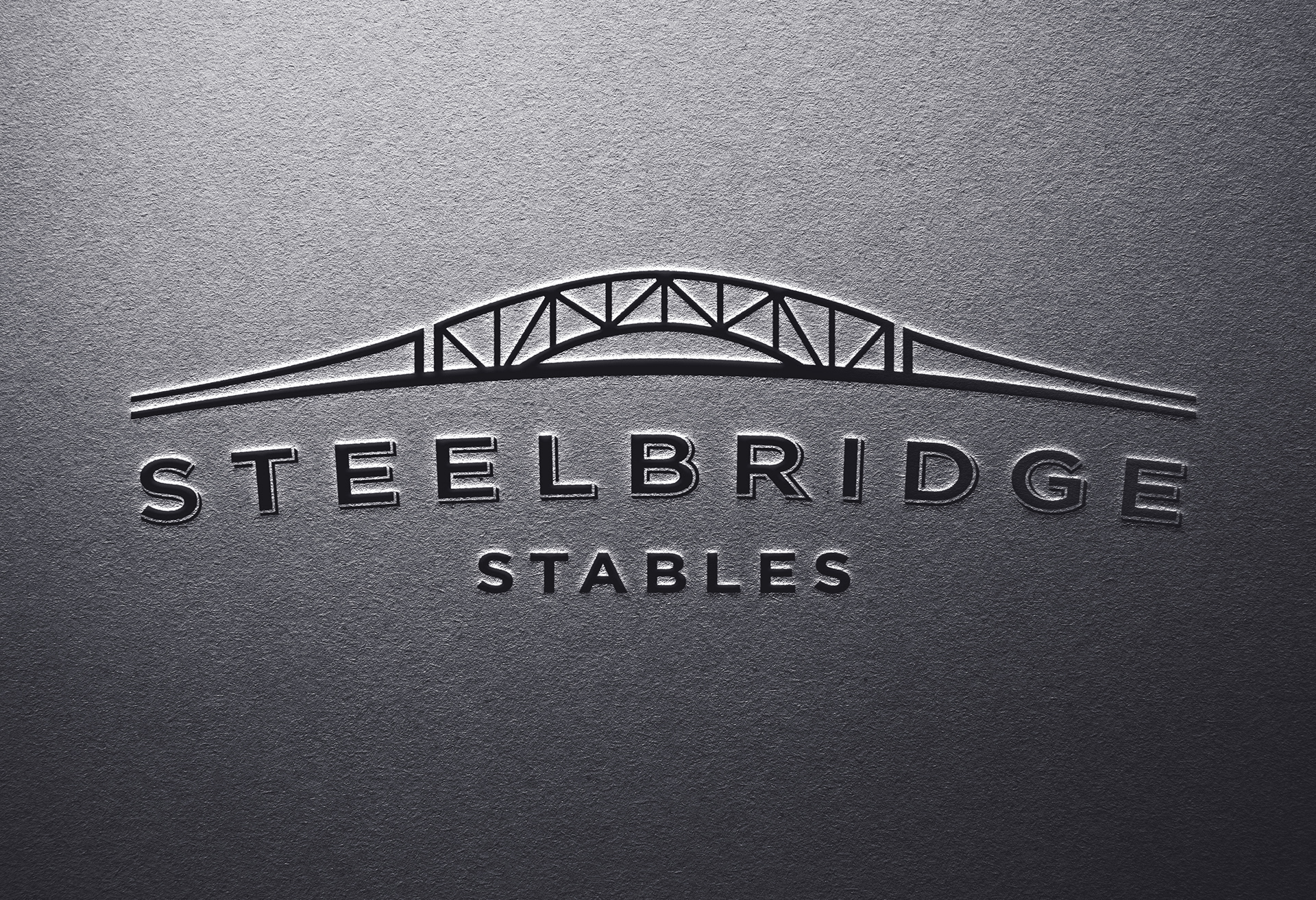
Step 3: Implementation
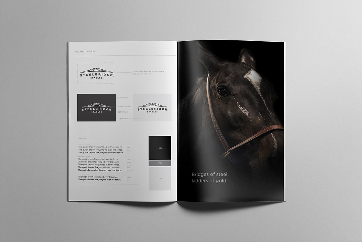
The scope of this project consisted of a logo, brand identity and style guide. The foundational design elements needed to successfully implement the brand in market.
Credits: Frank Casera – Creative & Design Director, Brand Strategy.