Already with shovels in the ground on many active projects, the company rebranded itself from Western Asset Management Group (WAM) to ONE Properties in order to expand its business in Ontario and the U.S. The challenge was rebranding a successful operating company without confusing the marketplace and its customers. We addressed this by intimately understanding how they conducted business and arriving at insights and an identity solution that reflected the company’s most authentic self.
The exploratory creative work began where everything ultimately takes place – on paper.
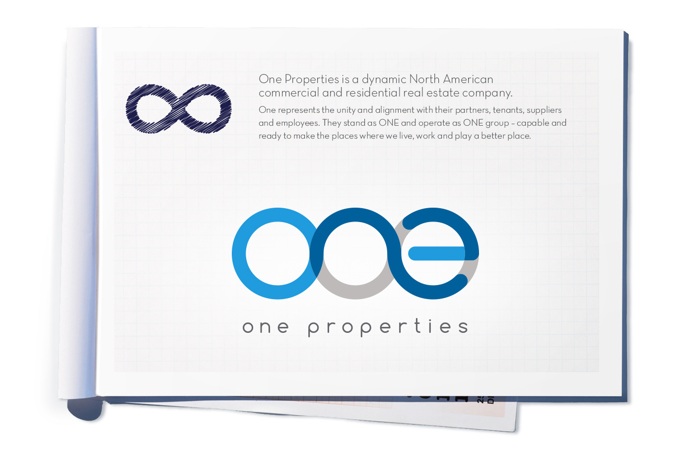
These discoveries were based on stakeholder interviews, client workshops, and the idea brief developed from the final brand strategy. As revealed within the strategy, ONE Properties represents the unity and alignment with their partners, tenants, suppliers and employees. They stand as ONE and operate as ONE. Ready to make the places where we live, work and play a better place to be.


Initial creative executions and attributed 'brand values' inspired four unique areas to consider. Once agreed to, the clear choice went into further design development.

From the initial shortlist, we agreed the final logo identity should best reflect the values, process and relationship One Properties shares with it’s clients and partners:
Transparency
Continuous
Dynamic
Continuous
Dynamic
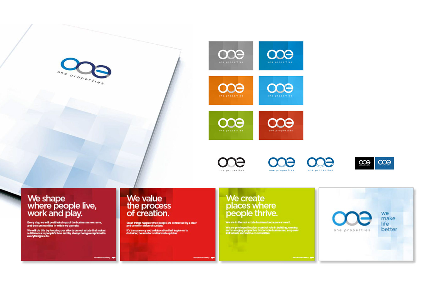
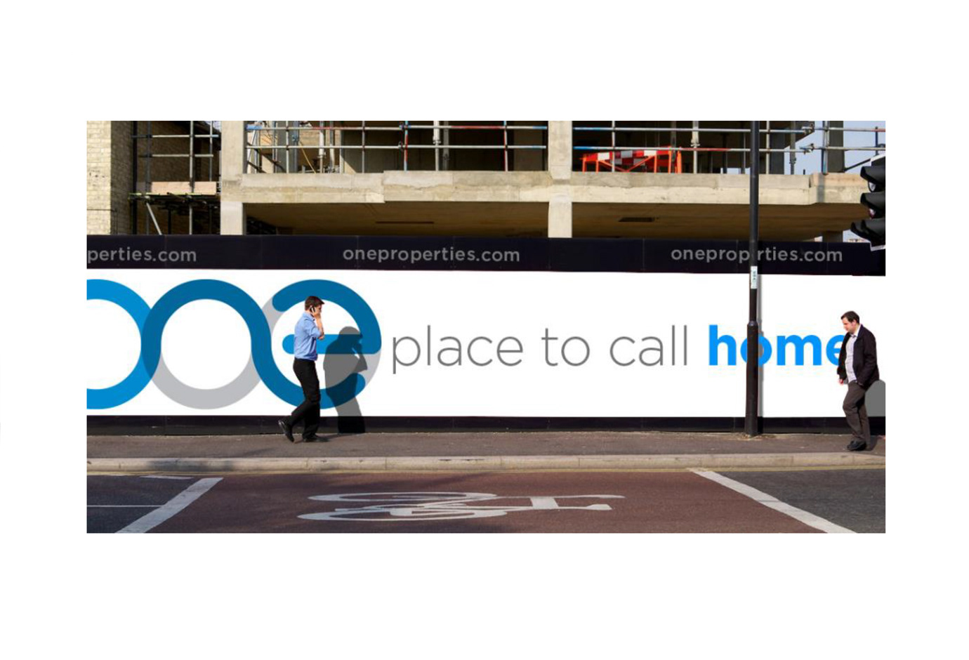
The brand has one default corporate colour: blue. However, it’s never restricted – having the ability to integrate into different environments. This was important because it needed to support a variety of sites, such as retail, residential/commercial developments and property management.

The Corporate Website was built in Wordpress and has some robust features and functionality contained within the Properties section of the website. Site updates are easily performed internally, with regular property updates and information.
Credits: Frank Casera – Creative Director and Design Lead, Stephen Thut – Designer, Dean Moore – Account Manager